
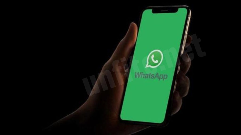
WhatsApp is rolling out major interface updates in India. The latest upgrade showcases a refreshed design with the app’s signature green accents, reinforcing its brand identity. It is now accessible to users on both Android and iPhone devices.
Is WhatsApp rolling out a new interface in India?
The rollout of these updates has started in India, following early reports from earlier this month. However, the update is not yet reaching all users.
WhatsApp has revamped its design, colors, icons, and various features. According to a blog post, these changes provide a modern look and enhance accessibility and user experience.
What has changed on WhatsApp for Android?
Unlike Light Mode’s more restrained use of white space, Dark Mode delivers a significantly richer visual experience. WhatsApp has refreshed its interface with a new color palette, adding green accents to stay true to its brand identity.
The update includes redesigning buttons and icons, which now feature new colors and shapes. Furthermore, WhatsApp has broadened the availability of its features. The bottom navigation tabs now display the WhatsApp logo, while the top navigation tabs have been removed from the Chats section. According to The Times of India, this update is currently available on certain Android smartphones.
What has changed on WhatsApp for iOS?
Some iPhone users in India have noticed that their screens now display the brand’s signature green tint. However, the Light and Dark Modes have not been changed. Additionally, the navigation controls for WhatsApp on iPhones remain at the bottom, with no modifications in that area.
Overview of the New User Interface
Description of the Main Features of the New Interface
The latest WhatsApp update introduces a refreshed user interface to enhance user experience and modernize the app’s appearance. Key features of the new interface include:
- Revamped Color Palette: The interface now features a sleek new color scheme with updated hues that reflect a contemporary look while maintaining the app’s signature green accents.
- Redesigned Navigation: Navigation elements have been streamlined for easier access. The bottom navigation bar now prominently displays the WhatsApp logo, simplifying user interaction.
- Enhanced Icons and Buttons: Icons and buttons have been redesigned with new shapes and colors, making them more intuitive and visually appealing.
- Improved Accessibility: The update includes changes that enhance readability and ease of use, including better contrast and more explicit icons.
Significant Visual Changes and Design Improvements
- Modernized Aesthetics: The interface has adopted a more polished and modern look with refined lines and smoother transitions. The use of gradients and subtle shadows adds depth to the design.
- Consistent Branding: The green accent color, a hallmark of WhatsApp’s brand identity, is used strategically throughout the interface to reinforce brand recognition while maintaining a fresh appearance.
- Streamlined Layout: Elements such as the chat list and contact information are now more organized, reducing visual clutter and improving navigation efficiency.
Incorporation of Brand Colors and Aesthetics
- Signature Green Accents: The update retains WhatsApp’s iconic green color, incorporating it into various interface elements to ensure brand continuity. This green is used in icons, buttons, and navigation bars to align with WhatsApp’s established color scheme.
- Enhanced Visual Cohesion: The new design integrates brand colors in a cohesive and balanced way, improving the overall user experience while staying true to WhatsApp’s visual identity.
- Aesthetic Consistency: The interface improvements reflect a commitment to aesthetic consistency, ensuring that the updated design elements complement the brand’s overall look and feel.
Key Changes and Enhancements
New Color Palette and Design Elements
- Updated Color Scheme: The new interface features a modern color palette with refined shades. While maintaining the signature green, WhatsApp has introduced complementary colors that enhance readability and visual appeal.
- Modern Design Aesthetics: The design now includes sleek lines, subtle gradients, and smooth transitions, which contribute to a more contemporary and polished look.
- Consistent Branding: The iconic green color is used strategically throughout the interface, ensuring brand recognition while harmonizing with the new visual elements.
Changes in Button Styles, Icons, and Navigation
- Redesigned Buttons: Buttons have been given a fresh look with updated shapes and colors, making them more intuitive and visually appealing. New button styles include rounded corners and more prominent call-to-action elements.
- Revamped Icons: Icons are now more modern and consistent, with more straightforward designs and updated colors. This helps improve the clarity and usability of the app’s features.
- Streamlined Navigation: The navigation bar has been repositioned, with the WhatsApp logo now prominently featured in the bottom navigation. This change simplifies access to critical features and improves overall navigation efficiency.
Functionality Improvements

New Features or Enhanced Usability Aspects
- Enhanced Chat Management: The update includes improved chat management tools, such as more accessible access to search and filter options, making organizing and finding conversations more straightforward.
- Improved Media Handling: Upgrades to media handling capabilities allow quicker access to media files and improve organization within chats.
Improvements in Accessibility and User Experience
- Enhanced Accessibility: The interface updates include better contrast and larger touch targets, making it more accessible for users with varying visual abilities.
- User Experience Enhancements: The user experience has been refined with smoother transitions, faster load times, and more intuitive interaction elements. These improvements contribute to a more seamless and enjoyable user journey.
Frequently Asked Question
What are the main features of the new WhatsApp user interface?
The new interface includes a refreshed color palette, redesigned buttons and icons, and streamlined navigation with improved accessibility. The color scheme incorporates WhatsApp’s signature green, and the navigation bar now prominently displays the WhatsApp logo.
When will the new interface be available for all users in India?
The rollout has begun in India, but reaching all users may take some time. Availability can vary based on device type and other factors.
Which devices are currently receiving the new interface update?
The update is being rolled out to both Android and iPhone users. Specific availability may depend on the device model and operating system version.
What changes have been made to the navigation controls in the new interface?
The bottom navigation bar now features the WhatsApp logo, and the top navigation tabs have been removed from the Chats section. This change aims to simplify navigation and improve user experience.
Are there any changes to the Light and Dark Modes with this update?
No, this update has not altered the Light and Dark Modes. The interface changes focus primarily on visual design and navigation improvements.
How has the design of buttons and icons been updated?
Buttons and icons have been redesigned with new shapes, colors, and styles. This includes more intuitive and visually appealing elements to enhance usability.
Will the update improve the app’s accessibility?
Yes, the new interface includes enhancements for better accessibility, such as improved contrast and larger touch targets, making the app more user-friendly for individuals with different needs.
How can I check if I have received the new interface update?
To check if you have the new interface, look for changes in the color scheme, navigation bar, and button styles. If you have not seen these updates, waiting for the rollout to reach your device may be a matter of waiting.
Conclusion
The introduction of WhatsApp’s new user interface for Indian users marks a significant update, bringing a modernized look and enhanced functionality to the popular messaging app. With its refreshed color palette, redesigned buttons and icons, and streamlined navigation, the update aims to improve user experience and accessibility. While the rollout continues, the new interface promises a more intuitive and visually appealing interaction for users across Android and iPhone devices.
As WhatsApp continues to evolve, this update reflects the company’s commitment to staying current with design trends and user needs. Users are encouraged to explore the new features and provide feedback to help shape future updates. Overall, this redesign is a step forward in enhancing how users connect and communicate on WhatsApp.