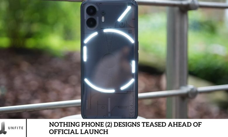
The anticipation for the upcoming Nothing Phone (2) is building as the brand continues to impress with its innovative and unique designs. The newly teased design of the Nothing Phone (2) is already generating buzz, thanks to its signature transparent back and eye-catching glyph lights.
In this article, we’ll explore the exciting design features of the Nothing Phone (2) revealed ahead of its official launch. We’ll cover the color options, overall design aesthetics, camera specifications, and much more, giving you a complete overview of what to expect from this highly anticipated device.
Where Was Nothing Phone (2) Design Teased?
YouTuber Marques Brownlee, also known as MKBHD, teased the new design of the Nothing Phone (2) in a “Dope Tech” video. Additionally, the official Nothing team has tweeted about the phone’s design.
The video compares the design changes to the previous year’s Nothing Phone (1). The footage primarily highlights the updated Glyph Interface as the main new feature. However, it does not provide any details on the software, other hardware specifications, or hands-on experience with the device.
What Has Changed In Nothing Phone 2?
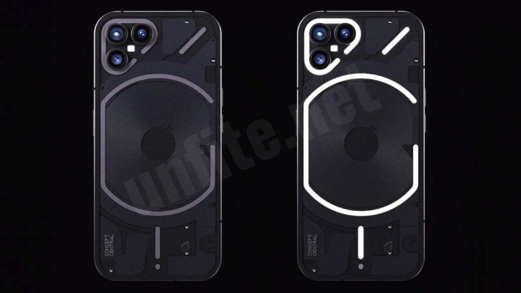
Color: The Nothing Phone (2) introduces a new gray color scheme and slightly rounded edges, giving it a refined look. A white color option is also available. The display remains flat, but the front punch-hole camera cutout has been moved to the center.
Design: The LED strip design has undergone significant changes. Unlike the previous model, where the strip surrounding the wireless charging coil was a single continuous line, it has now been divided into six separate parts.
Camera: The camera module features 33 addressable lighting zones and includes two distinct LED strips. Around the wireless charging coil, the top right LED strip contains 16 zones with customizable lighting.
Glyph Lights: The Glyph lights in the Nothing Phone (2) are much more functional than in the previous version. They can now display volume levels, adjust to your set timer, show notifications, and even track the progress of your cab or food delivery, specifically with Uber and Zomato.
The “exclamation icon” dot and the bottom LED strip still serve as charging indicators. These features are handy when the phone is placed face down.
Nothing Phone (2) Design Teased Ahead of Official Launch
The description provides an overview of the initial design tease for the Nothing Phone (2), highlighting how it was first introduced to the public and what unique features were hinted at in the teasers.
- Initial Design Tease by Marques Brownlee (MKBHD) and the Official Nothing Team: Marques Brownlee, a well-known tech YouTuber, provided the first glimpse of the Nothing Phone (2) design in his “Dope Tech” video. This teaser generated excitement and gave the audience a sneak peek into the upcoming phone’s design changes. The official Nothing team also shared design teasers on their social media platforms, contributing to the buzz and anticipation surrounding the launch.
2. Overview of the Unique Design Elements: The teasers from MKBHD and the official Nothing team highlighted several key design elements that set the Nothing Phone (2) apart from its predecessor. These include:
- New Color Options: A new gray color option and a white variant enhance the phone’s aesthetic appeal.
- Slightly Rounded Edges: The design shows a shift towards softer, more rounded edges, giving the phone a sleek and modern look.
- Centrally Placed Front Punch-Hole Camera: Unlike the previous model, the punch-hole camera is now centrally placed on the front, which may offer a more balanced design.
- Updated LED Strip Design: The LED strip around the wireless charging coil is no longer a continuous line but is divided into six parts, enhancing both the visual appeal and the customization options.
- Revamped Glyph Interface: The new Glyph Interface offers more functionality and customization, potentially allowing users to personalize their phone’s light notifications and other interactive features.
- Customizable Lighting Zones: The camera module features 33 addressable lighting zones, which give users more control over lighting effects and enhance user interaction.
Fundamental Design Changes in Nothing Phone (2)
Comparison of the New Design to the Previous Nothing Phone (1)
Design Evolution:
- Nothing Phone (1): The original Nothing Phone was notable for its transparent back and distinctive LED strip that encircled the wireless charging coil. A clean, angular aesthetic and flat, rectangular form characterizes its design. The transparent back showcased the internal components, aligning with the brand’s ethos of transparency and innovation.
- Nothing Phone (2): The new model retains the transparent back but introduces several design refinements. The Phone (2) features slightly rounded edges, moving away from the Phone (1) ‘s sharp corners, which enhances ergonomics and gives the device a more polished look. Additionally, the central placement of the front punch-hole camera offers a more balanced and modern appearance compared to the Phone (1) ‘s off-center positioning.
LED Strip Updates:
Nothing Phone (1): The original phone’s LED strip was a continuous, single line that ran around the wireless charging coil, providing a distinctive light effect.
Nothing Phone (2): The LED strip has been redesigned into six separate segments, which adds a new layer of visual complexity and customization. This segmented design allows for more intricate lighting effects and integrates better with the updated Glyph Interface.
Discussion on the Updated Color Options and Overall Aesthetics
Color Options:
- Nothing Phone (1): Available in basic black and white color options, the Phone (1) offered a straightforward, minimalist look that complemented its transparent back and LED design.
- Nothing Phone (2): This device introduces a new gray color option in addition to the existing white. This new gray variant adds a touch of sophistication and modernity to the design. The subtle, refined color choices cater to a broader range of aesthetic preferences, enhancing the overall appeal of the device.
Overall Aesthetics:
- Nothing Phone (1): The Phone (1) had a unique, avant-garde design with its transparent back and visible internal components, which set it apart from other smartphones on the market. Its flat edges and minimalistic approach emphasized functionality and innovation.
- Nothing Phone (2): Refines the original design with smoother, rounded edges and updated color options, making the phone appear more contemporary and stylish. The central punch-hole camera, combined with the new segmented LED strip, contributes to a more cohesive and balanced design. These changes reflect a move towards greater sophistication and user comfort while still maintaining the brand’s commitment to distinctive and functional design elements.
New Color Options and Enhanced Aesthetics
Details About the New Gray Color Scheme and the Availability of a White Option
New Gray Color Scheme:
The Nothing Phone (2) introduces a sophisticated new gray color option, which adds a modern and elegant touch to the device. This gray finish is designed to be subtle yet striking, appealing to users who prefer a more understated and refined look. The new color enhances the phone’s premium feel while maintaining the transparent back that the Nothing brand is known for.
Availability of White Option:
In addition to the new gray color, the Nothing Phone (2) will also be available in a classic white option. The white variant retains the minimalist and clean aesthetic of the original Phone (1), offering a timeless and versatile choice for users who appreciate a more straightforward, more traditional look.
Commentary on the Slightly Rounded Edges and the Central Front Punch-Hole Camera Cutout
Slightly Rounded Edges:
The Nothing Phone (2) features slightly rounded edges, a notable departure from the Phone (1) ‘s sharp, angular corners. This design change enhances the device’s ergonomics, making it more comfortable to hold and use. The rounded edges also contribute to a more refined and contemporary appearance, aligning with current design trends that favor smoother, more fluid shapes over rigid lines.
Central Front Punch-Hole Camera Cutout:
The new central placement of the front punch-hole camera is a significant design update. Unlike the Phone (1), which had its camera positioned in the top-left corner, the Phone (2) centers the camera cutout on the display. This adjustment not only improves the visual balance of the screen but also reduces distractions caused by the off-center placement. The central punch-hole is more in line with modern smartphone design trends and offers a more symmetrical and aesthetically pleasing look.
Upgraded LED Strip and Glyph Interface
Explanation of the Redesigned LED Strip
The Nothing Phone (2) features a redesigned LED strip that has been segmented into six distinct parts around the wireless charging coil. This update represents a significant departure from the continuous LED strip found on the Phone (1).
Redesigned LED Strip:
- Segmented Design: Unlike the previous model, which had a single, unbroken line, the new design divides the LED strip into six separate segments. These segments are strategically placed around the wireless charging coil, allowing for more complex and customizable light patterns.
- Enhanced Customization: The segmented design enables a variety of lighting effects and notifications that can be tailored to user preferences. Each segment can light up independently or in specific patterns, creating a more dynamic and visually engaging experience.
- Improved Aesthetics and Functionality: This new approach improves the phone’s visual appeal and enhances its functionality by providing more precise and customizable notifications through the LED strip.
Highlight of the New Glyph Interface and Its Enhanced Functionality
New Glyph Interface:
- Enhanced Features: The Nothing Phone (2) ‘s glyph interface has been significantly upgraded compared to the previous model. It now offers a broader range of functionalities, providing users with more interactive and valuable light-based notifications.
- Customization Options: Users can customize the Glyph lights to display various notifications, such as incoming calls, messages, or app alerts. The lights can also be programmed to show different colors and patterns based on the type of notification, enhancing both visibility and personalization.
- Integration with Apps: The updated Glyph Interface integrates with popular apps like Uber and Zomato, allowing users to track the status of their rides or food deliveries through the phone’s light patterns. This added functionality makes the Glyph Interface not just a design feature but a practical tool for real-time updates.
Comparison to Previous Model:
- Improved Utility: While the Glyph lights in the Nothing Phone (1) were mainly used for basic notifications and charging indicators, the Phone (2) expands on these capabilities by offering more detailed and customizable light patterns. This makes the Glyph Interface more valuable and versatile for everyday interactions.
- Visual and Functional Enhancements: The new Glyph Interface provides a more engaging and functional user experience, combining aesthetics with practicality. The ability to customize light patterns and integrate them with apps enhances the phone’s overall usability.
Frequently Asked Question
What are the fundamental design changes in the Nothing Phone (2) compared to the Nothing Phone (1)?
The Nothing Phone (2) introduces slightly rounded edges, a new gray color option alongside white, a centrally placed front punch-hole camera, and a redesigned LED strip segmented into six parts. These updates refine the device’s aesthetics and ergonomics.
What new color options are available for the Nothing Phone (2)?
The Nothing Phone (2) will be available in a new gray color option in addition to the classic white. The gray finish provides a modern and sophisticated look, while the white option maintains a minimalist aesthetic.
How has the LED strip design changed in the Nothing Phone (2)?
The LED strip around the wireless charging coil has been redesigned from a continuous line to six separate segments. This segmentation allows for more customizable and intricate lighting effects.
What is the Glyph Interface, and how has it been improved in the Nothing Phone (2)?
The Glyph Interface is a lighting system that provides visual notifications through the phone’s back panel. The Phone (2) offers enhanced functionality with customizable light patterns, support for app integrations (like Uber and Zomato), and more detailed notifications compared to the previous model.
How does the new front punch-hole camera placement in the Nothing Phone (2) differ from the previous model?
The Nothing Phone (2) features a centrally placed front punch-hole camera, which provides a more balanced and symmetrical appearance compared to the Phone (1) ‘s off-center camera placement.
Are there any changes to the back panel design of the Nothing Phone (2)?
The Nothing Phone (2) retains the transparent back design of the Phone (1) but updates the LED strip and introduces slightly rounded edges. This combination enhances both aesthetics and ergonomics while maintaining a transparent look.
What practical benefits does the segmented LED strip offer?
The segmented LED strip allows for more precise and customizable lighting effects. Users can configure different segments to display various notifications and alerts, improving the phone’s functionality and personalization.
Will the Nothing Phone (2) support wireless charging?
Yes, the Nothing Phone (2) will continue to support wireless charging. The updated LED strip design surrounding the wireless charging coil provides both aesthetic and functional enhancements.
How does the updated Glyph Interface enhance user interaction with the phone?
The enhanced Glyph Interface allows users to set up custom light patterns for different notifications and integrates with popular apps for real-time updates. This makes the interface more interactive and practical for daily tasks.
Conclusion
The Nothing Phone (2) is shaping up to be an exciting evolution of the original Nothing Phone (1). It showcases several thoughtful design enhancements that promise to captivate users and set new standards in smartphone aesthetics. The teased updates, including the sophisticated new gray color, refined rounded edges, and centrally placed front punch-hole camera, reflect a move toward a more polished and user-friendly design.
The redesigned LED strip, now segmented into six parts, enhances both the visual appeal and functionality of the device, offering a more customizable and dynamic lighting experience. Additionally, the improved Glyph Interface adds significant value with its advanced notification capabilities and app integrations, making it a practical tool for everyday use.